I remember sitting on my floor three years ago, surrounded by dozens of tiny, expensive paint swatches that all looked exactly the same under my dim living room light. I was paralyzed, convinced that if I didn’t follow some complex, designer-approved mathematical formula, I would somehow ruin my entire sense of calm. Most “experts” will tell you that picking a palette is about following rigid rules or spending a fortune on professional consultations, but honestly? That’s just noise. When you’re trying to figure out how to choose a color scheme, the secret isn’t in a textbook; it’s about understanding how those hues actually interact with your brain and your daily rhythm.
I’m not here to give you a lecture on color theory that feels like a college seminar. Instead, I want to share a practical, psychology-backed approach to selecting colors that actually serve you. We’re going to strip away the intimidation and focus on how to align your environment with your intentions, whether you’re designing a workspace for deep focus or a bedroom for restorative rest. My goal is to help you stop overthinking and start creating a space that fuels your potential without the unnecessary stress.
Table of Contents
Mastering the Psychology of Color in Home Decor
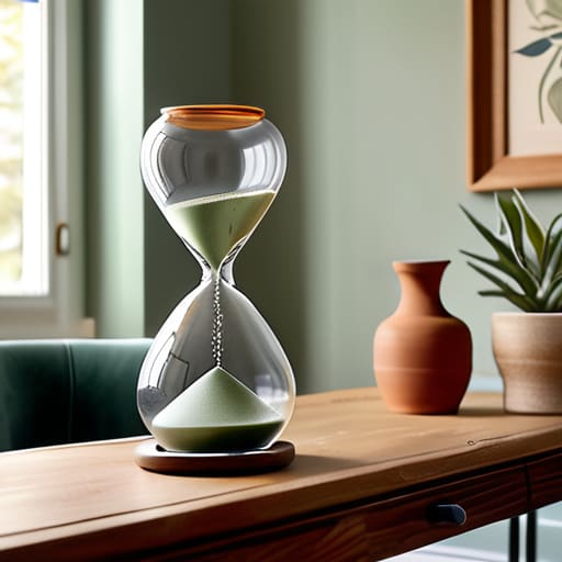
When I sit down with my vintage hourglasses to reset after a long day, I’m not just looking for silence; I’m looking for a space that feels mentally restorative. This is where the psychology of color in home decor becomes your most powerful productivity tool. Colors aren’t just aesthetic choices; they are neurological triggers. For instance, if you’re designing a home office, you might lean toward cool tones like soft blues or sage greens to lower your cortisol levels and foster deep focus. Conversely, if you’re tackling a creative project in your studio, a splash of energetic terracotta can provide that necessary spark of motivation.
The secret to a space that feels intentional rather than chaotic is understanding how to balance these emotional responses. I always tell my clients that creating a cohesive room palette is about more than just matching pillows to rugs; it’s about managing the “vibe” of each zone. You might experiment with monochromatic color schemes to create a sense of calm and order in a bedroom, or use high-contrast accents to define a workspace. By aligning your palette with your mental goals, you transform your home from a mere backdrop into a sanctuary that supports your best self.
Navigating Warm vs Cool Color Palettes for Emotional Balance
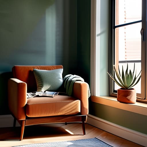
When I’m designing a new layout in my bullet journal or reimagining a corner of my apartment, I always start by asking: How do I want to feel when I walk into this space? This is where the tension between warm vs cool color palettes becomes your most powerful tool for emotional regulation. Warm tones—think terracotta, soft ochre, or sunset corals—are like a psychological hug; they radiate energy and intimacy, making them perfect for social hubs like a dining room or a cozy reading nook. However, if you overdo the warmth in a small workspace, you might find yourself feeling restless rather than inspired.
On the flip side, cool tones like sage greens, dusty blues, or soft lavenders act as a mental reset button. Drawing from my background in psychology, I know that these hues can lower our perceived heart rate and foster a sense of calm. If you’re struggling with burnout, leaning into these cooler shades can help create a sanctuary for deep focus. The trick isn’t to pick one or the other exclusively, but to find a balance that mirrors your personal rhythm.
My Five Golden Rules for Finding Your Perfect Palette
- Start with your “Anchor Piece.” Before you obsess over swatches, look at that vintage rug or that velvet armchair you absolutely love. Let that one item dictate the DNA of your color scheme so the room feels cohesive rather than a random collection of choices.
- Apply the 60-30-10 Rule to avoid visual overwhelm. I always tell my clients to think in proportions: 60% of the space should be your dominant neutral, 30% your secondary color, and a mere 10% for those bold, “personality” accents. It keeps the brain from feeling overstimulated.
- Test your colors in different lighting throughout the day. A shade that looks like a calming sage in my morning light might turn into a moody, murky forest green by 6 PM. Grab some peel-and-stick samples and watch how they shift as the sun moves—it’s a total game-changer.
- Use color to “zone” your activities. If you’re working from a corner of your living room, lean into cooler, focused tones like blues or soft greys to signal to your brain that it’s time to produce. Save the energetic terracotta or sunny yellows for the spaces where you actually want to unwind.
- Don’t fear the “bridge” color. If you’re worried about two different palettes clashing, find a single shade that exists in both. It acts as a visual thread, pulling the disparate elements together and making the whole design feel intentional rather than accidental.
Finding Your Rhythm Through Color
Treat your color palette as a tool for intentionality rather than just an aesthetic choice; ask yourself how you want to feel in a space before you pick up a swatch.
Use the psychological weight of warm and cool tones to create emotional boundaries, ensuring your environment supports your specific productivity needs and mental rest.
Avoid the trap of “more is more” by selecting a cohesive scheme that reduces visual clutter, allowing your brain to focus on what truly matters instead of being overwhelmed by sensory noise.
Design with Intention
“Choosing a color scheme isn’t just a decorative task; it’s an act of environmental design. When you select colors that resonate with your psychological needs, you aren’t just painting walls—you’re curating a space that supports your focus and protects your peace.”
Ella Thompson
Designing Your Intentional Space
As we wrap up our journey through the world of color, remember that choosing a palette isn’t just a design task—it’s an exercise in self-awareness. We’ve explored how the psychological weight of different hues can shift your mood, how the tension between warm and cool tones affects your emotional equilibrium, and how to align your visual surroundings with your deepest intentions. Whether you are leaning into the calming embrace of soft blues to foster focus or the energizing spark of terracotta to fuel creativity, the goal is to ensure your environment works with you rather than against you. By applying these principles, you aren’t just decorating a room; you are curating a sanctuary that supports your mental well-being.
At the end of the day, don’t let the fear of making a “wrong” choice paralyze your progress. I often find myself staring at my vintage hourglasses when I feel overwhelmed by a decision, reminding myself that time is too precious to spend it in indecision. Your home should be a living reflection of your evolving journey. If a color scheme no longer serves your rhythm, remember that you have the power to evolve. Trust your intuition, lean into the psychology of your space, and design a life—and a home—that truly fuels your soul.
Frequently Asked Questions
How do I pick a color scheme that works for both my productivity and my need to relax after a long day?
It’s the ultimate productivity paradox: how do we stay sharp at 10 AM but actually unwind by 8 PM? I’ve found the secret lies in “zonal color theory.” Instead of one single palette, think about your environment in layers. Use high-contrast, energizing tones in your workspace to trigger focus, but keep your transition areas—like a reading nook or your bedroom—grounded in muted, low-saturation hues. It’s all about signaling your brain that the workday is officially over.
I’m worried about making a mistake—what are some foolproof ways to test a palette before committing to paint or furniture?
I totally get that “analysis paralysis”—I’ve definitely stared at paint swatches until my eyes crossed! To avoid buyer’s remorse, start small. Grab a few samples and paint large poster boards rather than the wall itself; this lets you move them around to see how light shifts throughout the day. Even better? Use digital mockups or fabric scraps. Test the vibe in your actual environment before you commit your hard-earned budget.
How much should I let my existing furniture and lighting dictate my color choices versus my personal style?
Think of your furniture and lighting as the “anchor” of your room, but don’t let them become the captain. I like to view my existing pieces as the baseline—they dictate the practical constraints, like the undertones of your sofa or the warmth of your lightbulbs. However, your personal style should always drive the emotional intent. Use your furniture as a foundation, but let your aesthetic choices be the soul that breathes life into the space.
